
An art therapist reveals why bright red can overstimulate a living space – and the four calming shades to try instead
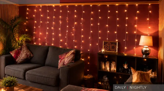
If your living room never quite feels as relaxing as you’d like, the problem might not be your furniture or layout – it could be the colour on your walls.
According to Dr Eleni Nicolaou, art therapist and creative wellness expert at Davincified, bright, saturated red can be particularly overstimulating in a room designed for unwinding.
“Red is one of the most physiologically stimulating colours there is,” says Dr Nicolaou. “It activates the nervous system, raises heart rate, and signals alertness, which is great in certain contexts, but the opposite of what you want in a room designed for rest.”
Its visual intensity can also make a room feel smaller, while large areas of red – from an accent wall to a sofa or rug – can become difficult for the eye to ignore.
“An accent wall is one of the most common places I see red used with the best intentions,” she says. “But a full wall of bright red doesn’t recede into the background; it dominates.”
So what should you use instead?
Soft blues
Dusty slate, pale teal and other muted blues can create a feeling of openness without making a room feel cold. “Soft blue creates a sense of space without feeling cold,” says Dr Nicolaou.
Muted greens
Sage, olive and muted forest shades can introduce a more natural, grounded feel, whether used on walls or through furnishings and accessories.
Warm neutrals
Soft creams and warm whites can make a living room feel comfortable and welcoming without becoming bland. “Warm neutrals are far from boring,” says Dr Nicolaou. “The right shade makes a space feel homely and cosy.”
Terracotta and beige
For those who love warmer tones, earthy terracotta and soft beige offer richness without the intensity of vivid red.
And you don’t necessarily need to banish red altogether. Using it in smaller doses – such as cushions, artwork or decorative pieces – can add energy without allowing it to dominate the room.
“Colour doesn’t have to be all-or-nothing,” says Dr Nicolaou. “It’s about being intentional with how much visual weight each colour is carrying.”
Ultimately, the best living room is one that feels right for you – but if your bold red walls are leaving you feeling anything but relaxed, it might be time to reach for the paint chart.